Insite CMS redesign
Creating a better CMS
Overview
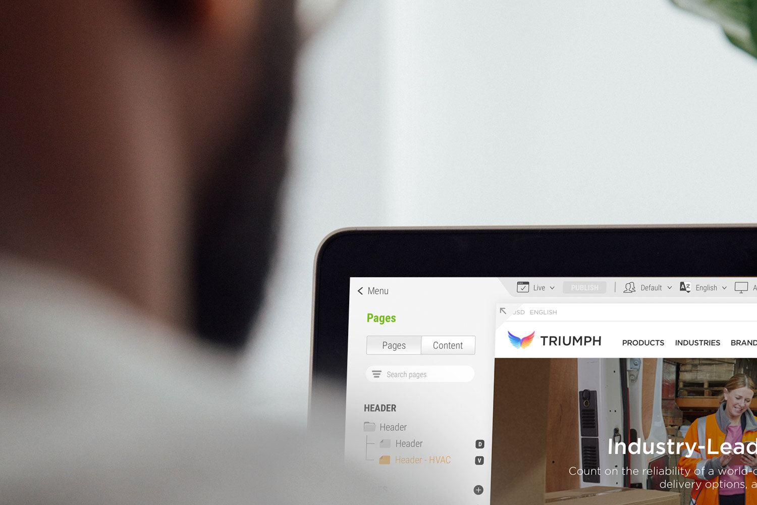
Insite Software’s Content Management System (CMS) empowers multiple users to easily create and manage responsive web content for B2B eCommerce sites. With a role-based permissions architecture, teams can collaborate efficiently, allowing different users to edit, review, and approve content. This robust CMS gives marketers the tools to design personalized experiences, delivering dynamic, user-specific content to craft tailored buying journeys, while also enabling cross-sell and up-sell merchandising and promotional opportunities.
A standout feature is the built-in A/B testing capability, a powerful tool that helps optimize content and drive higher ROI for Insite’s customers.
My Role
Hands-on User Experience Director
Responsibilities
User Research, Product Strategy, Aligning Stakeholders on Product Goals, Prototyping, Design User Flows, Visual Design, Interaction Design
Tools and Methods
Sketch, InVision, Agile
The Problem
Commerce teams are overly dependent on developers for front-end builds and updates, leading to increased costs
Although the existing CMS provides powerful features to manage your B2B eCommerce site, it primarily caters to technical users like developers or implementation partners. Managing and maintaining an online storefront requires CSS expertise, and the platform’s user experience isn’t intuitive for non-technical users. This results in slow turnaround times for routine updates and higher operational expenses.
Additionally, when partners customize storefront functionality, these changes often disrupt the front-end during regular software updates.
The Goal
Redesign the CMS to empower non-technical users with intuitive components for creating modern storefronts
This redesign aims to enhance core CMS functionality while improving the overall user interface. It will introduce robust real-time editing and site theming features, enabling non-technical commerce teams to confidently build and maintain eCommerce storefronts.
By leveraging advanced technologies like React and Redux, all components will be rewritten to reduce the risk of breaking changes and support flexible customizations. Additionally, new content components will be developed as the foundation for quickly building content pages, with access to common templates for seamless content creation.

Research
User interviews
During my initial research, I conducted interviews with over 20 subject matter experts and team members from various companies within our Customer Advisory Board (CAB). In one interview, the project sponsor highlighted that limited resources and budget constraints made the internal developer a bottleneck for routine updates—tasks that other team members should be able to handle. Relying on external partners for these updates disrupted priorities and strained budgets.
Additionally, I discovered that many customers were frustrated with how long it took to build content in our CMS. Repetitive, cumbersome tasks created inefficiencies, leading to a poor user experience and increased implementation costs.
Key findings
Subject matter experts expressed interest in these high-level features to address common CMS challenges:
Implement Storefront Theming
Provide global site theming options with no CSS knowledge required to maintain quality and consistency for various team members.
Provide Page Templates
Allow users to select from common page layouts to build content faster with the ability to customize for site specific needs.
Implement Real-time Editing
Improve overall experience for users previewing changes or building content in real-time to reduce repetitive and cumbersome content creation.
Introduce Smart Content
Save time by having the ability to edit and manage dynamic content in one convenient spot which resides on multiple pages.
Asset creation
Defining features
Building on my research, I created new personas and used scenario maps to identify product features for key touchpoints. This approach helped the UX team gain a deeper understanding of what personas would do, think, and feel in various situations, guiding the design process effectively.
Prioritized
Feature List
Each scenario uncovered new ideas. From here, I made a list of high-level features and the team prioritized product features by themes: Metric movers, Customer Requests and Customer Delight. The next step was to breakout product features by feasibility, desirability and viability, with the goal to reduce personal bias and to look at each feature through a more objective lens.
Asset Creation
Wireframes
With new features defined, a product roadmap was created to prioritized development for the CMS redesign and I wireframed each state to accommodate the agile process and present to the product team.
CMS - Main Menu
CMS - Pages (Shell)
CMS - Mobile Responsive View
Product Design
Prototype Screens
CMS - Main Menu [New Feature]
Pages - Desktop Responsive View
Pages - Website Preview Mode
Pages - Tablet Responsive View [New Feature]
Pages - Mobile Responsive View [New Feature]
Pages - Create A Page with Template [New Feature]
Pages - Add Image [New Feature]
CMS - Edit Video Component [New Feature]
Pages - Edit Commerce Page [New Feature]
Pages - Add Banner Image [New Feature]
Pages - Edit Product Carousel [New Feature]
Pages - Edit Page Variant
Design - Theme Editor [New Feature]
Design - Style Guide [New Feature]
See it in action
CMS Experience
In order to demonstrate the desired UX experience for the entire product team, it was important to explore how the CMS framework would feel as a user would navigate the application.


![CMS - Main Menu [New Feature]](https://images.squarespace-cdn.com/content/v1/5ecd4fefe89946698323472c/1591594039228-L6K46W9NTAWAF21PST3W/insite-cms-menu.jpg)


![Pages - Tablet Responsive View [New Feature]](https://images.squarespace-cdn.com/content/v1/5ecd4fefe89946698323472c/1591591697178-LDV28ZSSZ7BQGGX3MGN2/insite-cms-tablet.jpg)
![Pages - Mobile Responsive View [New Feature]](https://images.squarespace-cdn.com/content/v1/5ecd4fefe89946698323472c/1591591704346-JIDPHKNFZQODMPY8RA7U/insite-cms-mobile.jpg)
![Pages - Create A Page with Template [New Feature]](https://images.squarespace-cdn.com/content/v1/5ecd4fefe89946698323472c/1591760186987-6K572241BQZQZXUR81D5/insite-cms-create-a-page.jpg)
![Pages - Add Image [New Feature]](https://images.squarespace-cdn.com/content/v1/5ecd4fefe89946698323472c/1591769511723-LZNOQ4CM94JTFDARHM0D/insite-cms-add-element.jpg)
![CMS - Edit Video Component [New Feature]](https://images.squarespace-cdn.com/content/v1/5ecd4fefe89946698323472c/1591769566244-3THTUGYDFSJUG2IDR0R8/insite-cms-edit-video.jpg)
![Pages - Edit Commerce Page [New Feature]](https://images.squarespace-cdn.com/content/v1/5ecd4fefe89946698323472c/1591597039462-1QWLQ3W3NL07FPCHLJMP/insite-cms-edit-commerce-page.jpg)
![Pages - Add Banner Image [New Feature]](https://images.squarespace-cdn.com/content/v1/5ecd4fefe89946698323472c/1591766065893-HBKKSZM4TML8FSR9E7OA/insite-cms-add-image.jpg)
![Pages - Edit Product Carousel [New Feature]](https://images.squarespace-cdn.com/content/v1/5ecd4fefe89946698323472c/1591765623121-Q2Q1VIADBAF1XR2YJPNY/insite-cms-edit-product-carousel.jpg)

![Design - Theme Editor [New Feature]](https://images.squarespace-cdn.com/content/v1/5ecd4fefe89946698323472c/1591763905117-8O1GAQI4V7UQK8UQ01JG/insite-cms-design-theme-editor.jpg)
![Design - Style Guide [New Feature]](https://images.squarespace-cdn.com/content/v1/5ecd4fefe89946698323472c/1591764193863-Q36934R14A82U0TTJ15V/insite-cms-design-style-guide.jpg)
